Interdigitate
Project Info
Personal project
Role
Art director, Graphic Designer
Timeline
2019
Project Type
Editorial Design, Typography, Art Direction
Interdigitate (of two or more things) interlock like the fingers of two clasped hands. It is also figuratively used to imply a smooth interweaving of disparate things, such as the blending of two cultures within a shared region.
Through this project, I aim to embody the pain and sorrow a lot of people in Korea are going through due to reluctant separation. Thus, the focus around the project is on the emotional tension coming from the “will to be interdigitated” versus “forced separation”.
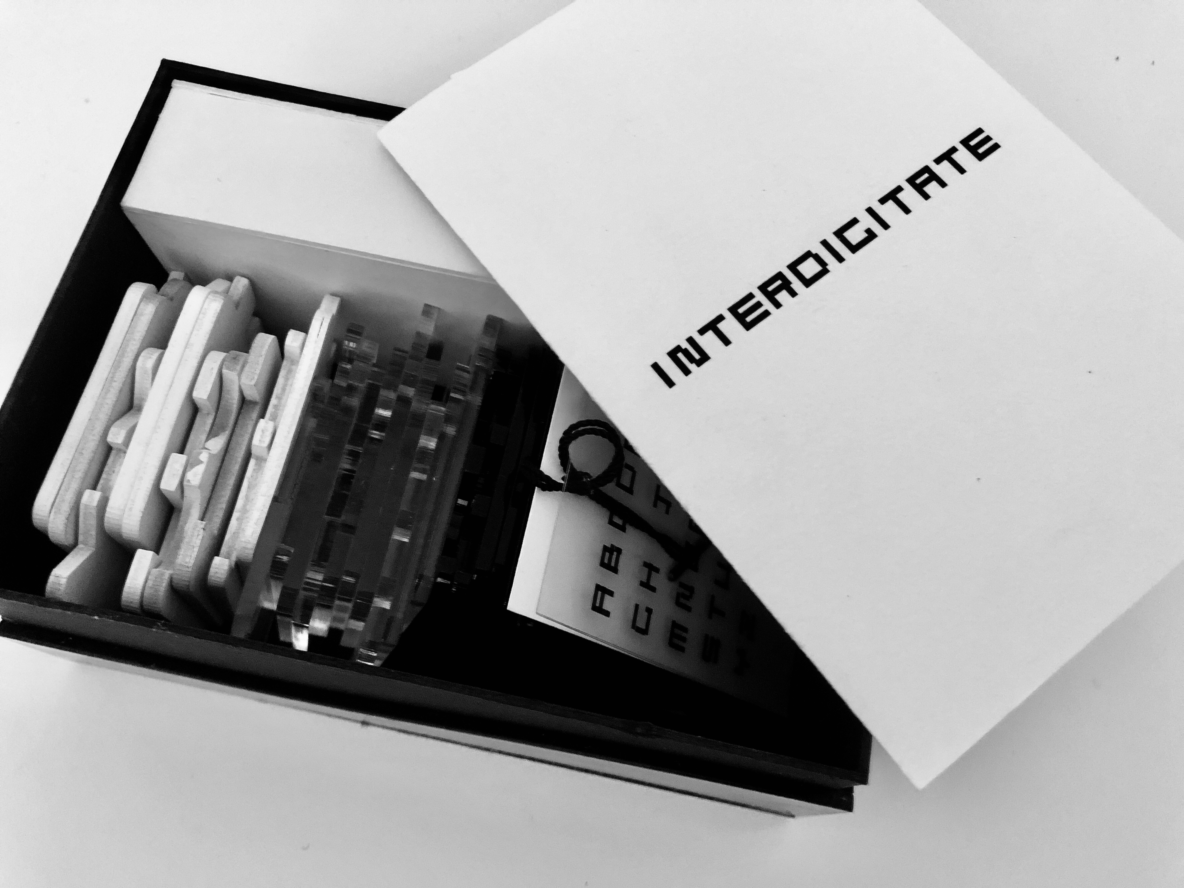
All products are packed in the ‘interdigitate kit’ with a series of posters and descriptions. This was to make a completely branded kit derived from a single letter.
The interdigitate type
Interdigitate typeface is composed of two separate set of lines, which form a complete letter only when they are interlocked together. The letter blocks give people to physically interact with the piece and enjoy ‘interdigitating’ experience.
Through this project, I aim to embody the pain and sorrow a lot of people in Korea are going through due to reluctant separation. Thus, the focus around the project is on the emotional tension coming from the “will to be interdigitated” versus “forced separation”.
All products are packed in the ‘interdigitate kit’ with a series of posters and descriptions. This was to make a completely branded kit derived from a single letter.
The interdigitate type
Interdigitate typeface is composed of two separate set of lines, which form a complete letter only when they are interlocked together. The letter blocks give people to physically interact with the piece and enjoy ‘interdigitating’ experience.